
Evolution of a Logo – Case Study
Tanya Toledano, the Founder of montrealmom.com, conceived of the company many years ago when her husband, family and friends started to refer to her as “Tanya 411” due to the parenting and lifestyle questions she would get on a regular basis. After realizing that the information she had collected through her own research and practical experience would be best archived as a series of pages online, she began to seek out a website and branding development company to work with to realize her vision. As fate would have it, Tanya was referred to Neal Caminsky, the Founder of Red Dream Studios and they met at a Tim Hortons in the West Island (September 22, 2008 to be exact). According to Tanya, when she met with Neal, after having met with several other candidates previously, she knew that he understood her vision and goals with the site and its brand, and instantly felt a connection with him.
The process of developing a logo for montrealmom.com soon commenced. The initial idea was to incorporate a kangaroo into the logo, as it’s a highly recognizable symbol of motherhood and nurturing.
This initial concept was first conceived of, and was initially well-received. But the colours didn’t appeal to Tanya as they were too soft and pastel-like, nor did the block-serif font for the tagline.
The next round of changes incorporated several different 2-tone colour palettes that were more vivid and worked well together. But the head of the kangaroo just didn’t seem right. The font of the tagline was also changed to a sans-serif font (News Gothic), while interestingly enough, the font of the company name, Port Credit, never swayed from the initial concept.
 At the suggestion of Tanya and her daughter, they wanted to see a version of the kangaroo with its head looking forward with a set of “smiling eyes.” In order to achieve this effect, inspiration was drawn from the eyes of the robot, Eve, from the Pixar film “Wall-E.”
Ultimately, though, the versions of the kangaroo with the head in profile was preferred, but the “smile” definitely needed to be incorporated, be it through the eyes, or with a grin.
![]()
It should be noted that kangaroos don’t actually smile, so it was difficult to conceptualize what the shape of its mouth should look like.
We tried to make the smile even bigger. But ultimately, the addition of the open mouth didn’t make the kangaroo look happy, but instead sly and devious.
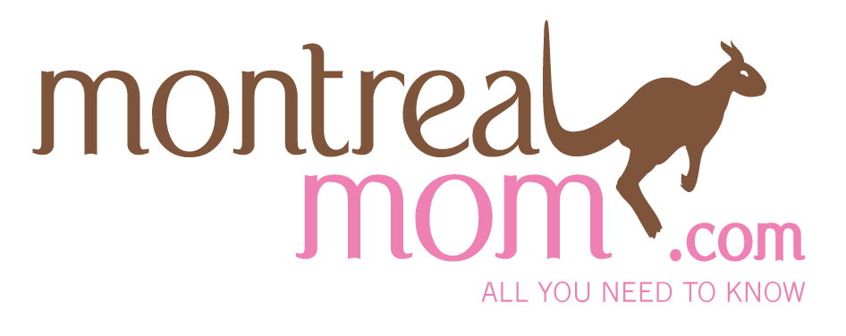
Above, the final version of the logo. The mouth was removed and the head softened and rounded overall. The beaned-crescent shape for the smiling eye was kept from the previous version.
The logo was well-received by the client and has been in use ever since, taking only a few weeks from initial conception to achieve the final result.


